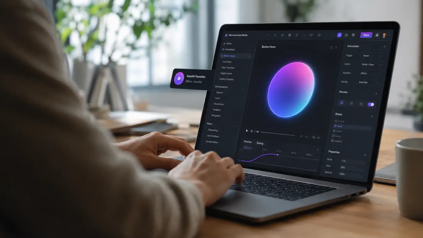
Microanimations in web design are the small movements that tell people an interface has noticed them. A button changes state after a click. A form field shows that an email address is valid. A progress indicator confirms that a file is still uploading. Each moment lasts only a fraction of a second, but it removes a question from the user’s mind.
That is the real value of motion in an interface. It should explain what happened, show what will happen next, or make a change easier to follow. When animation has no job beyond attracting attention, it quickly becomes clutter.
For small-business websites, the difference matters. Visitors often arrive with a specific task: compare a service, submit a form, book an appointment, or buy a product. Thoughtful motion can make those steps feel clearer and more reliable. Poorly planned motion can slow the same visitor down.
What Microanimations in Web Design Actually Do
A microanimation is a short visual change inside an interface. It might be a color transition, a small movement, a progress state, or a brief change in scale or opacity. It gives the user information without requiring another sentence of copy.
A microinteraction is the complete exchange around that moment. It begins with a trigger, follows a rule, provides feedback, and may repeat or change depending on the state. The animation is often the visible feedback inside that exchange.
Consider a website form. The user enters a password, the system checks the requirements, and each completed requirement receives a checkmark. The checkmark animation is the microanimation. The trigger, validation rule, feedback, and ongoing state make up the microinteraction.
The distinction is useful because it keeps designers focused on behavior rather than decoration.
| Element |
What It Is |
Website Example |
| Microanimation |
A brief visual movement or transition |
A button compresses slightly when clicked |
| Microinteraction |
A complete response to one user action or system event |
A form validates an entry and confirms success |
| UI animation |
A broader transition between states or sections |
A mobile navigation panel opens and closes |
Why Microanimations Improve UX and Engagement
Good microanimations reduce friction. They make an interface easier to understand, which gives visitors more confidence to continue.

They Confirm That an Action Worked
People should not have to click twice because a website gave no response the first time. A pressed button state, a saved indicator, or a short success animation confirms that the system received the action.
This is especially important for contact forms, checkout steps, account settings, and booking tools. Immediate feedback makes the website feel responsive even when the underlying process needs another second to finish.
They Prevent Errors Before They Become Frustrating
Inline validation can show whether a field is complete, whether a password meets the rules, or whether a required option is missing. The feedback appears close to the action, so the user can correct the problem without hunting for an explanation.
Motion should support the message, not replace it. A red shake alone is easy to miss and may be meaningless to someone who cannot perceive the color or movement. Pair the visual cue with clear text and an accessible error state.
They Guide Attention to Meaningful Changes
Interfaces change as people use them. A cart count increases, a filter updates the results, or a new section appears after a selection. A restrained transition helps the eye follow that change.
The key word is restrained. Constant pulsing, bouncing, or scroll-triggered movement competes with the content. Use motion where the user needs orientation, then let the page settle.
They Make Waiting Easier to Understand
A progress bar or loading state cannot make a server respond faster, but it can show that the request is moving forward. That distinction reduces uncertainty. It also stops users from refreshing a page or abandoning a task that is still working normally.
Whenever possible, show meaningful progress rather than an endless spinner. Uploading 3 of 5 files is more useful than an animation with no indication of status.
They Add Personality at the Right Moment
A small brand-specific motion can make a product feel considered. A checkmark might draw itself after a successful form submission. A toggle can move with a distinctive rhythm. A subtle transition can connect two related states.
Save expressive motion for moments that deserve it. If every hover effect tries to be memorable, none of them will be.
Common Microanimation Examples on Websites
Most effective microanimations are familiar. Users understand them quickly because the movement matches the task.
| Trigger |
Microanimation |
User Benefit |
| Hover or keyboard focus |
Button color, border, or elevation changes |
Shows that the element is interactive |
| Form entry |
Checkmark, message, or field-state transition |
Confirms valid input or explains an error |
| Submit action |
Button changes to loading and then success |
Prevents repeat clicks and shows progress |
| Add to cart |
Product moves toward the cart or the count updates |
Confirms that the item was added |
| Expand control |
Chevron rotates as content opens |
Connects the control to the revealed content |
| Page or data load |
Skeleton state or progress indicator appears |
Shows that content is still loading |
| Toggle |
Handle moves between two labeled states |
Makes the current setting easy to recognize |
These patterns work because they answer practical questions: Is this clickable? Did my action work? What changed? Is the website still processing my request?
Best Practices for Microanimations in Web Design
Animation decisions should start with the user’s task, not with an effect library.
Give Every Movement a Clear Job
Write the purpose in one sentence before building the animation. For example: This transition shows that the form was submitted, or This movement connects the filter control to the updated results.
If the only explanation is it makes the page more interesting, the effect probably needs another reason or should be removed.
Keep the Timing Proportionate to the Action
Simple feedback should feel immediate. More complex transitions may need slightly more time so users can understand how one state became another. There is no single duration that fits every interface, but most small feedback animations should finish within a few hundred milliseconds.
Test the result in context. An animation that looks smooth in a design file may feel slow after a visitor repeats it several times.
Build a Consistent Motion Language
Similar components should respond in similar ways. Buttons should share timing and easing. Panels should open with a predictable direction. Success states should not look like warnings.
Consistency reduces the amount of behavior a visitor has to learn. It also makes a website feel more deliberate, even when the motion itself is subtle.
Respect Reduced-Motion Preferences
Some users experience dizziness, nausea, headaches, or distraction from interface motion. The W3C recommends allowing nonessential motion triggered by interaction to be disabled, and browsers expose the prefers-reduced-motion media query for this purpose.
Reduced motion does not require removing every state change. A moving panel can become an instant transition. A scale effect can become a color or opacity change. The user still receives feedback without unnecessary movement. See the
W3C guidance on animation from interactions and
MDN’s reduced-motion implementation guide for practical guidance.
Protect Page Performance
Animation that stutters or shifts the layout weakens trust instead of building it. For many common effects, transform and opacity are safer choices because browsers can often handle them without recalculating the page layout on every frame. The
web.dev animation performance guide explains why properties that trigger layout or paint require more care.
Avoid animating large areas without a reason. Compress visual assets, limit simultaneous effects, and test on a mid-range phone as well as a fast desktop computer.
Test More Than the Mouse
A hover effect does not help someone navigating with a keyboard or tapping a touchscreen. Interactive states must also work with focus, touch, and assistive technology.
Check the full sequence: the resting state, focus state, active state, loading state, success state, and error state. The animation is only one part of that system.
When Microanimations Hurt the User Experience
Motion becomes a problem when it takes control away from the visitor. Common warning signs include:
- scroll-jacking that changes the expected speed or direction of the page;
- content that cannot be read until an entrance animation finishes;
- looping effects that keep competing for attention;
- hover-only interactions with no keyboard or touch equivalent;
- animated width, height, or position changes that cause layout shifts;
- success or error feedback communicated through motion or color alone;
- long transitions that users must repeat during routine tasks;
- multiple components using different timing and easing for the same action.
If an effect delays reading, hides a control, or makes the page harder to predict, it is not helping engagement.
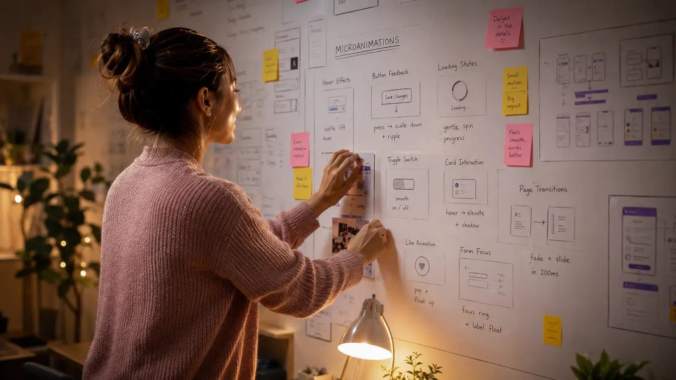
A Practical Microanimation Review Checklist
Before launching a new interaction, review it with the design and development teams:
- What user action or system event triggers it?
- What information does the motion communicate?
- Is the same information available without motion?
- Does it work with mouse, keyboard, and touch input?
- Does the interface respect prefers-reduced-motion?
- Does the animation avoid unexpected layout movement?
- Is it still comfortable after ten repetitions?
- Does it remain smooth on a mid-range mobile device?
- Can users complete the task if the animation fails to load?
This review catches most problems before they reach customers. It also gives the team a shared reason for keeping, changing, or removing an effect.
How Small-Business Websites Can Use Microanimations
Small-business websites do not need elaborate motion systems. A few well-placed interactions can make the most important conversion paths easier to use.
On a service website, a form button can show a loading state and a clear confirmation after submission. On an ecommerce site, the cart can acknowledge a newly added item without pulling the shopper away from the product page. A booking interface can mark completed steps and make the next action obvious.
Microanimations are also useful during a
website redesign because the team can review interaction patterns as part of the larger visual system. For campaign pages, thoughtful states should be planned alongside the layout and calls to action during
landing page design, not added as polish at the end.
The business goal still comes first. If a website struggles with unclear forms, weak calls to action, or confusing navigation, motion will not solve those structural problems. Start with usability, then use animation to reinforce it. That same principle applies to
conversion rate optimization: reduce friction first and measure whether the interaction actually helps.
FAQ: Microanimations and Microinteractions
What is the difference between a microanimation and a microinteraction?
A microanimation is the visible movement, such as a button changing shape or a checkmark appearing. A microinteraction is the whole feedback loop around one action: the trigger, the rules, the feedback, and what happens if the interaction repeats or changes state.
What are examples of microanimations in web design?
Common examples include hover and focus states, loading indicators, form validation, animated toggles, progress bars, expanding menus, cart updates, and success confirmations. Each one should explain an action or change in the interface.
How long should a microanimation last?
Most small feedback animations should feel immediate and finish within a few hundred milliseconds. The right duration depends on the distance traveled, the complexity of the change, and how often users repeat the action. Test it inside the real workflow rather than judging it as an isolated effect.
How do you make microanimations accessible?
Respect the user’s reduced-motion preference, provide a static or less motion-heavy alternative, and never rely on animation or color as the only form of feedback. Make sure the same interaction works with keyboard, touch, and assistive technology.
Can microanimations improve conversion rates?
They can support conversion by reducing uncertainty and making forms, carts, and calls to action easier to use. They cannot fix a weak offer, confusing page structure, or slow website. Measure task completion, errors, repeat clicks, and abandonment instead of assuming that more motion means more engagement.
The Bottom Line
The best microanimations are easy to miss and hard to misunderstand. They confirm actions, connect interface states, and help people move through a website with less uncertainty.
Start with one important task. Add the smallest amount of motion needed to make that task clearer, test it across devices and input methods, and provide a reduced-motion alternative. If your website needs a more usable interaction system, Digital Style Designs can help with
website development and a practical
website review.